How to Choose a Wedding Organizer Website Guests Will Use
A wedding organizer website should do one thing exceptionally well: make it effortless for guests to take the next right action, in under 10 seconds, on a phone, while they are distracted. If it feels like homework, requires an account, or hides key info behind too many taps, guests stop using it, and you end up answering the same questions for months.
This guide is a practical way to choose (or evaluate) a wedding organizer website that guests will actually use, not just admire.
Start with the real “guest jobs,” not your planning checklist
Couples often choose a wedding organizer website based on what they need (to-dos, vendor lists, budgets). Guests show up for different reasons:
- Confirm whether they are invited and RSVP correctly
- Find the location, time, parking, and dress code
- Book travel and understand the weekend schedule
- Check registry details and shipping rules
- Day-of, get quick answers without texting you
- Afterward, relive the day through photos
A great wedding organizer website is basically a low-friction decision tool for these moments.
A fast way to clarify your requirements
Before you pick a platform, write down:
- Your guest mix (age range, international travelers, tech comfort)
- Your event complexity (single venue vs multi-day, shuttles, dress codes)
- Your privacy needs (public, unlisted, password)
- Your “must-not-happen” list (wrong RSVP counts, guests missing shuttle times, registry confusion)
Then choose a site builder that makes those outcomes easy.
The non-negotiables: what guests notice immediately
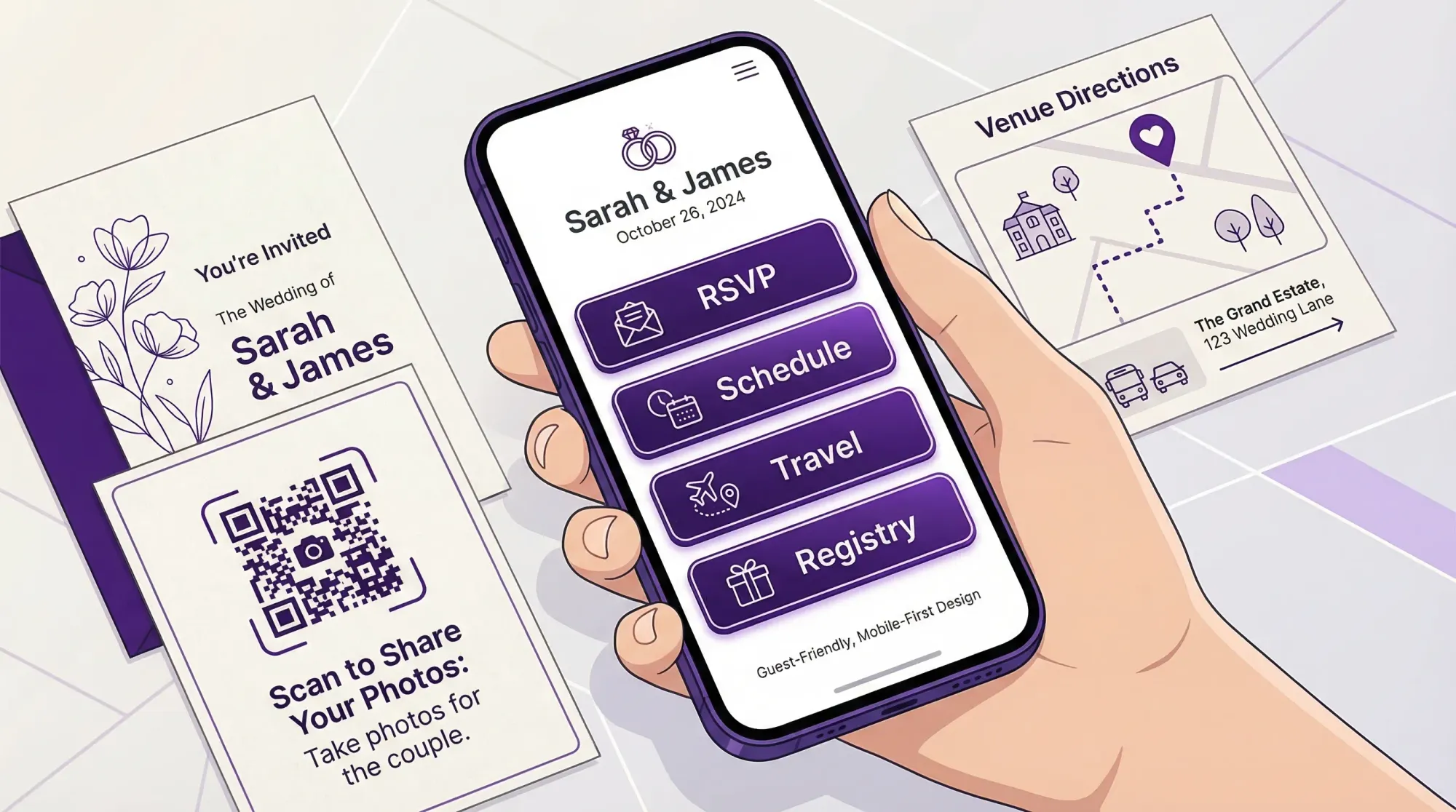
1) Mobile-first usability (because that is how guests will use it)
Most guests will open your wedding website from a text message on their phone. Your wedding organizer website should feel like it was designed for thumbs.
Look for:
- A clean home screen with 2 to 4 primary actions (RSVP, Schedule, Travel, Registry)
- Large tap targets and readable type
- Sticky navigation or a simple menu that is always easy to find
- No “tiny link” design choices that look pretty but fail on small screens
A simple rule: if a guest has to zoom, it is not guest-friendly.
2) A one-minute RSVP flow (no accounts, no friction)
RSVP is the highest-value workflow on your wedding organizer website, and also the easiest to break.
Prioritize:
- Minimal steps from landing page to confirmation
- Clear fields that match how families RSVP (plus-ones, households, kids)
- An obvious success state (guests should know their RSVP went through)
- A way to edit RSVP without starting over
Avoid platforms that push guests to create accounts, download an app, or “verify” through multiple screens. Every extra step costs you completions.
3) Information architecture that matches how guests think
Guests do not read wedding websites like a brochure. They scan. They look for the one thing they need right now.
Your navigation should map to guest questions:
- Schedule (include start times, not just vibes)
- Venue (address, parking, arrival instructions)
- Travel (hotel blocks, airports, rideshare notes)
- Registry (and shipping guidance for out-of-town guests)
- Contact (who to text day-of that is not you)
If your platform buries these under “Our Story” or forces a long scroll, it will underperform in the moments that matter.
4) Speed and reliability
Wedding weekends happen in real venues with real connectivity problems. A wedding organizer website that is heavy, slow, or glitchy will not get used.
Choose a platform that:
- Loads quickly on mobile data
- Works well inside in low-signal rooms
- Does not rely on huge video headers or overly complex animations
Google’s mobile-first indexing is about search, but the underlying reality applies here too: mobile experience is the experience.
Content that reduces texts (and prevents mistakes)
The “day-of essentials” block
Guests look for the same details again on wedding day. Make them impossible to miss.
Include a short block near the top of your site (or pinned on a “Wedding Weekend” page):
- Ceremony start time and “arrive by” guidance
- Exact venue address (tap-to-open maps)
- Parking and entrance instructions
- Dress code in plain language
- Whether phones are welcome during ceremony
This is less about being cute, and more about preventing the logistical chaos that steals attention from the day.
Travel information that answers real traveler questions
If you have out-of-town guests, the best wedding organizer website is the one that reduces uncertainty.
Look for a platform that lets you present travel info cleanly:
- Hotel block details and deadlines
- Shuttle pickup times and what to do if you miss one
- Accessibility notes (stairs, terrain, distance between spaces)
- Weather expectations (especially for outdoor ceremonies)
A “who to contact” plan that protects the couple
Even the best wedding organizer website cannot prevent every question, but it can reroute them.
Add:
- A designated day-of contact (planner, coordinator, trusted friend)
- A short line like “For day-of questions, text Alex at (555) 555-5555”
This one change keeps you present and reduces the constant phone checking.
Privacy and trust: guests need to feel safe clicking
Guests are increasingly cautious with links, especially older relatives and corporate professionals.
When choosing a wedding organizer website, prioritize:
- The ability to set your site to unlisted or password-protected (if desired)
- Clear ownership of your content and photos
- No confusing upsells that make guests think they are being sold to
If you use QR codes on signage, make sure the destination is exactly what guests expect. Mismatched branding and strange redirects reduce scans.
For accessibility and clarity standards, it can help to borrow from the basics of WCAG (readable contrast, clear labels, predictable navigation). You do not need to be an expert to benefit from the principles.
Use this quick evaluation table when comparing options
| Guest task (what they want) | Website feature (what enables it) | What “good” looks like in practice |
|---|---|---|
| RSVP correctly | Simple RSVP page | 1 to 2 minutes total, clear confirmation, easy edits |
| Get there on time | Maps + arrival instructions | Tap-to-open address, parking notes, “arrive by” guidance |
| Understand the weekend | Schedule view | Clean timeline by day, exact times, locations |
| Feel confident about attire | Dress code explanation | Plain-language examples, not just a label |
| Know what to do with gifts | Registry clarity | Links that work on mobile, shipping notes, group gifting if needed |
| Relive the wedding afterward | Photo sharing plan | One obvious destination, no logins, clear permission to share |
When you demo platforms, test each row on your own phone as if you were a guest.
The “3-person test” that prevents most regret
Before you commit to a wedding organizer website, run a quick usability test with three people who represent your guest mix:
- One tech-savvy friend
- One older relative
- One busy person who will not read carefully
Give them two tasks:
- “RSVP yes for the Smith family.”
- “Find the ceremony address and arrival time.”
Watch where they hesitate. If they hesitate, guests will too.
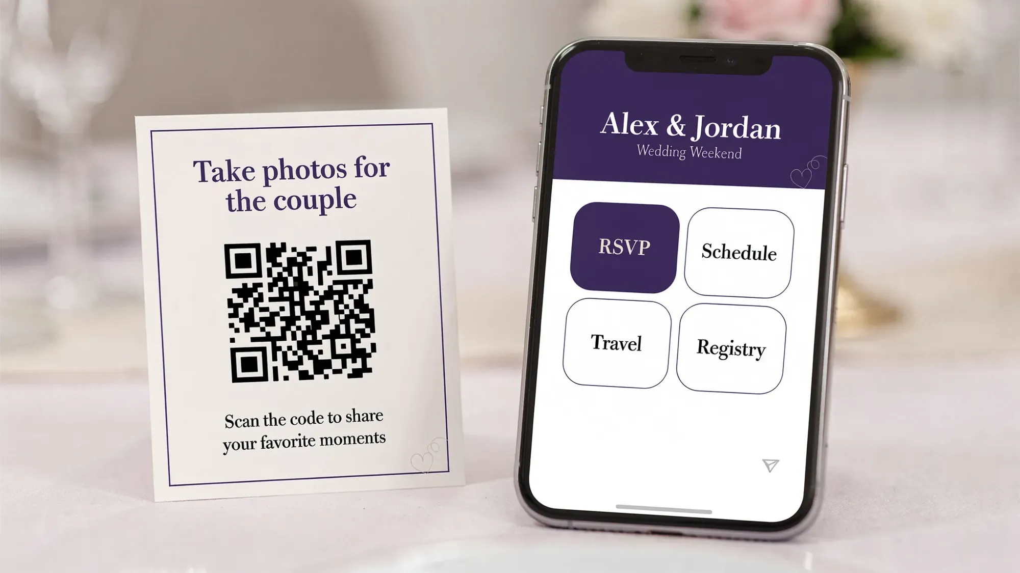
Don’t forget the “memories” layer: photo sharing that guests will actually do
Many couples build a solid wedding organizer website, then lose the photo game because sharing happens after the wedding, when everyone is tired and scattered.
If your goal is to actually collect guest photos, you want a system that:
- Works instantly during the event
- Requires no app install and no accounts
- Uploads automatically so nothing gets forgotten
- Produces one gallery instead of 15 different threads
Revel.cam is designed for this exact “guest friction” problem: guests scan a QR code (or tap an NFC tag) and take photos that upload automatically to a private event gallery, with host controls like per-guest photo limits, an end time, and optional review before sharing.
If you want the deeper playbook for guest photo collection, these guides pair well with your wedding website planning:
- Wedding Guest Photos: The Best Way to Collect Them Fast
- QR photo: The Complete Guide to Collecting Wedding Photos From Guests
- Wedding Photos: A Simple Plan to Avoid Missing Key Moments
The simplest way to integrate photos into your wedding organizer website
Use your wedding organizer website as the “home base,” then add one clear photo call-to-action:
- Add a navigation item labeled Photos
- On the wedding day, place QR codes on welcome signage, bar signage, and table cards
- Use one sentence of permission-focused copy, for example: “Take a photo, it will upload to our wedding gallery automatically.”
That is it. Guests do not need a tutorial, they need a single obvious next step.
Common platform traps (and how to avoid them)
Trap 1: Choosing a site that is beautiful but unclear
Design that prioritizes aesthetics over clarity often hides the exact info guests need. You can keep it gorgeous and still be obvious.
Fix: make RSVP and Schedule visible immediately, keep “Our Story” secondary.
Trap 2: Putting key logistics in a PDF
PDFs are hard to read on phones and easy to lose.
Fix: publish logistics directly on the wedding organizer website, then link out only for truly long-form items.
Trap 3: Treating photo sharing as “post-wedding admin”
If guests have to remember to upload later, most will not.
Fix: use an in-the-moment capture flow (QR to camera) so sharing happens while energy is high.
A decision checklist you can use today
A wedding organizer website guests will use tends to have the same characteristics every time:
- Mobile-first layout with clear primary actions
- RSVP that is fast and does not require accounts
- Schedule and travel info written for non-insiders
- A day-of contact plan that is not the couple
- Privacy settings that match your comfort level
- A simple memories plan, ideally with instant guest photo capture
If you already have a wedding website you like, you do not need to replace it to solve the photo problem. You can simply add Revel.cam as the photo layer.
To try it, create a private wedding Moment at Revel.cam and share your QR code on signage, or link it from your wedding organizer website’s Photos page.

A writer interested in connection, memory, and the everyday moments that matter more than we realize.
Tags: Wedding planning , Affordable wedding planning , Wedding planning app , Wedding planning tool